PRODUCT DESIGN CASE STUDYLaundrify
Role: User Experience & UI Design, Branding, Identity
Laundry has always been a household chore that can really be a bother to people. It can take up most of your day because you have to wait around to switch from washer to dryer and then fold immediately after the dryer is finished to avoid wrinkles.
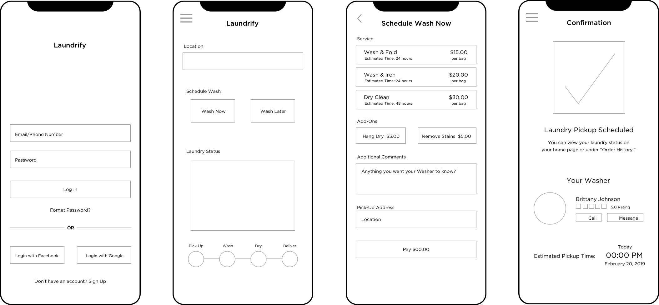
Laundrify allows users to pay to have their laundry picked up, washed, dried & folded, and delivered to their door without having to take any time away from their other daily obligations. It also can help to conserve water by allowing the “washers” to wash multiple person’s clothes at a time.

User Personas

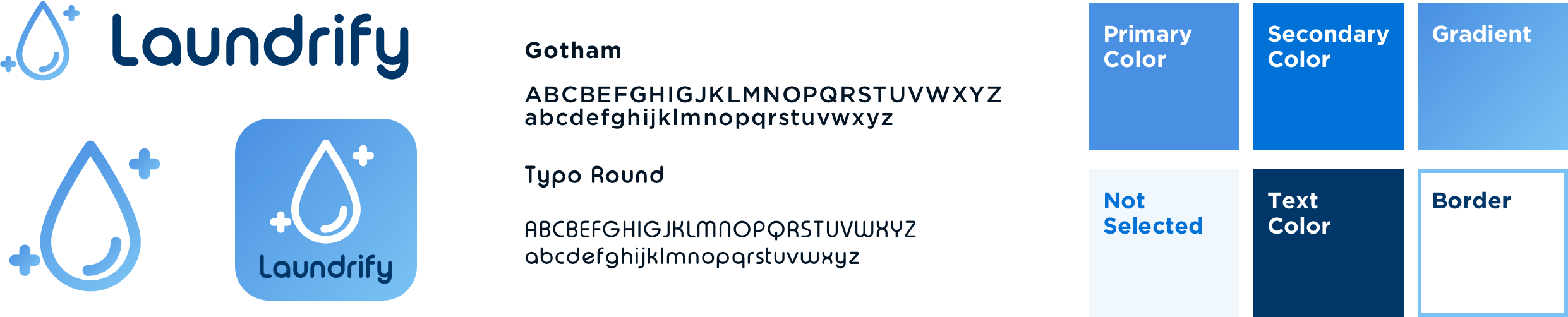
Style Guide
When choosing fonts, I decided to pick a simple san-serif font to use throughout the design. For the main logo font, I wanted one that was modern and bubbly to represent washing and cleanliness.
The blue colors throughout the app signify the connection to water and cleanliness. The use of blue and white together gives a clean appearance to the product overall.